
TrainingPeaks was one of the first platforms to introduce power curves, giving athletes the ability to view peak power for individual workouts, analyze aggregated power curves over different time ranges, and make direct comparisons between sessions.
The current TrainingPeaks power curve highlights the most commonly tested durations, including 5, 10, 12, 20, and 30 seconds, along with 1, 2, 5, 6, 10, 12, 20, 30, 60, 90, and 180 minutes. With the introduction of Analyze 360, an advanced analysis feature, TrainingPeaks is expanding this view to include hundreds of additional data points and a more detailed power profile.
Power curves offer valuable insights into workout performance, athlete strengths and weaknesses, and long-term progression. But they can be difficult to interpret if you’re not familiar with them. Keep reading to learn what power curves are and how you can use them effectively.
Understanding the Mean Max Power Curve
A peak power curve, also called a mean max power (MMP) curve, is created either from a single activity or from all of an athlete’s activities over a specified time range, such as the past 90 days, the current year or season, or their entire activity history. The power values plotted on the curve represent the highest mean average power (hence the term “mean max power”) achieved during the selected workouts.
For example, you can create a simple power curve for a single 75-minute ride by finding the peak 5-second, 1-minute, 5-minute, 20-minute, and 60-minute power values, then plotting those values on the y-axis against their respective durations on the x-axis. To create a 90-day peak power curve, you would follow the same method, except you’d select the highest power value from all rides in that period. In this case, your 5-second and 1-minute values might come from a town-line sprint during a group ride two days ago, while your peak 20- and 60-minute values could be from a gravel race last month.
The new power curves in TrainingPeaks use this same approach, but they calculate peak power for nearly every duration (such as peak 4:11 or peak 36:51), giving athletes and coaches far more detailed insights than were previously possible. This added data density is one of the most significant benefits of the updated power curves. More granular durations make it easier to target specific goals and monitor progress with greater precision.
For example, if an athlete is preparing for a 20-minute time trial, or tracking progress through a weekly series that lasts a little over 20 minutes, traditional power-curve durations would likely reflect meaningful improvements. But if the race or test lasts a little under 20 minutes—or falls between the longer time spans like 20 and 60 minutes—the standard durations might not be as useful. The enhanced power curve allows coaches and athletes to identify the most relevant segment of the curve for any goal or benchmark. (More on how to spot these improvements later.)
Two things to note:
- Power curves are often displayed with a logarithmic x-axis. There is just as much useful information between 1 and 90 seconds as there is between 90 seconds and 5 to 8 minutes, or between 8 and 60 minutes, so each of those periods should be equally visible. A linear scale would compress the shorter durations and make them harder to interpret.
- Not every single time point is calculated in a power curve, especially at longer durations where the curve flattens and changes slowly. For instance, an athlete’s peak 30-minute power might be 270 watts and their peak 40-minute power 265 watts. In that case, it’s not valuable to compute every point in that range—like 35:11 or 35:12—if they all fall at or near 267 watts.
Using Mean Max Power in Training
Once you understand how a power curve is generated and how to read it, you can use it to track progress and make informed training decisions.
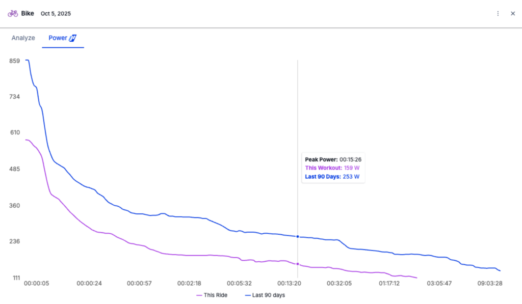
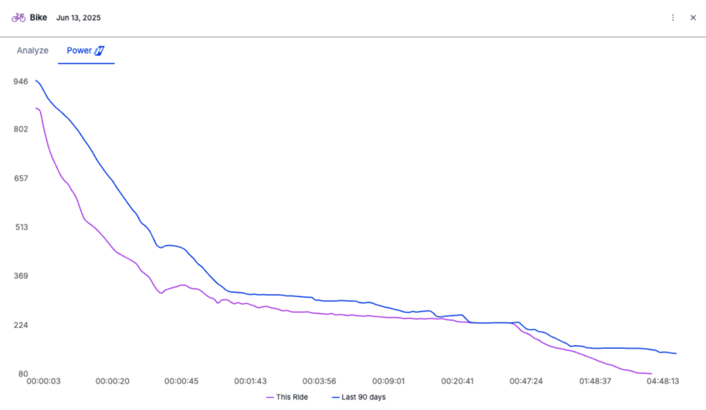
One of the most common applications of a peak power curve is to identify “new bests.” In TrainingPeaks, the default comparison overlays the power curve from the workout you’re analyzing with the curve from the past 90 days. A “new best” occurs wherever the workout curve exceeds the highest point on the comparison curve within that range.
In the virtual racing example below, the athlete set recent best values in both the sprint range (5 to 10 seconds) and in the medium aerobic zone (10 to 30 minutes). This pattern is typical of virtual races, which often require extended high-intensity efforts to stay with the group, followed by a sprint finish.
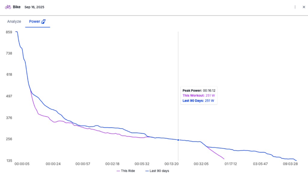
Even if no new bests were set, observing where the workout curve approaches the comparison curve can still reveal the nature of the ride at a glance.
For example, if the curve for a single ride is close to the 90-day curve in the 40- to 60-minute range but not in the shorter durations, this suggests a sustained hard effort with little sprinting or repeated anaerobic bursts. Recognizing the general shape of a power curve is another valuable tool, which we will explore next.
Interpreting the Shape of a Workout’s Mean Max Power Curve
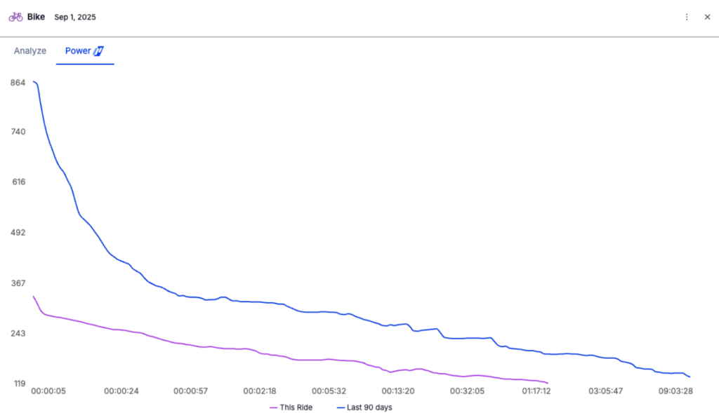
A low, flat curve typically indicates a steady, low-intensity ride such as a recovery session. This is shown in the example below, where the single-ride curve (in pink) stays well below the 90-day curve at all durations.
A flatter but higher curve suggests a sustained, higher-intensity effort such as a threshold interval session or time trial.
A curve with high values at shorter durations but relatively low values at longer durations likely reflects a workout or race focused on short, high-intensity efforts, such as repeated sprints. This is common in flat criteriums or road races where the athlete conserves energy until a final sprint.
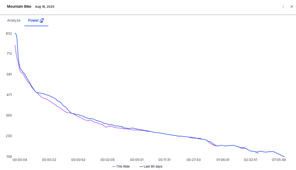
A curve that is high across most or all durations relative to the athlete’s recent bests indicates a demanding workout or race involving significant efforts throughout. Examples include road races with frequent attacks, rolling terrain, cross-country mountain bike events, or even a typical lunch ride at the TrainingPeaks office.
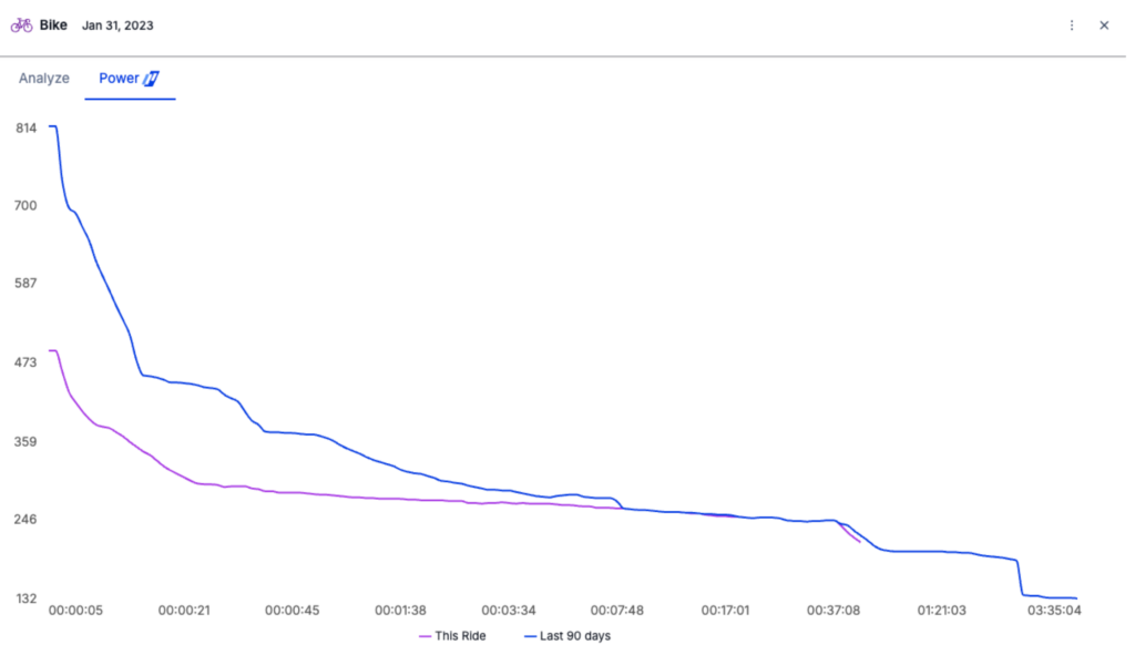
You can see in the example below that a significant portion of the curve from this ride is the peak power (or very close to it) for the entire 90-day window preceding the workout, indicating maximal efforts across a variety of durations.
Insights from the 90-Day Power Curve
While an individual ride’s curve can provide insights into the nature of that specific workout, the aggregated 90-day power curve can reveal broader trends about an athlete’s strengths and weaknesses. When an athlete has tested themselves across different durations such as short sprints, medium glycolytic efforts, and longer aerobic intervals, the 90-day curve forms a distinct shape that broadly represents the three metabolic energy systems. These transitions are gradual and overlapping, so the ranges below are approximate.
- 1 to 15–30 seconds: Represents sprinting and the ATP-Creatine Phosphate system.
- 30 seconds to 4–8 minutes: Represents glycolytic energy production.
- Beyond 8 minutes: Represents aerobic energy production.
Why a 90-day window?
Ninety days is generally accepted as a valid period to judge an athlete’s current abilities without requiring new tests. If an athlete has recorded a best performance within that period, it is reasonable to assume they can repeat it with similar fitness. Beyond 90 days, changes in conditioning may mean a new effort is needed to verify current capacity.
Deciphering Athlete Phenotypes from Power Curves
The shape of an athlete’s power curve can help identify their physiological profile, sometimes called their phenotype, which in turn can inform training priorities. The graphic below provides examples of typical curve shapes and their associated athlete types:
- Sprinter: High short-duration power with a steep drop-off, indicating strong sprint capability but weaker sustained power.
- Pursuiter: Good sprint ability combined with high one- to five-minute power, suited to bridging gaps, leading out sprints, and making late-race attacks in road, cyclocross, or short-format mountain bike events.
- All Rounder: Strong short- and medium-duration power with a gradual taper across longer durations, indicating versatility in road or mountain bike racing.
- Time Trialist: A flatter curve with strong long-duration power and weaker short-duration output, suited to time trials, long-course triathlon, or ultra-endurance racing.
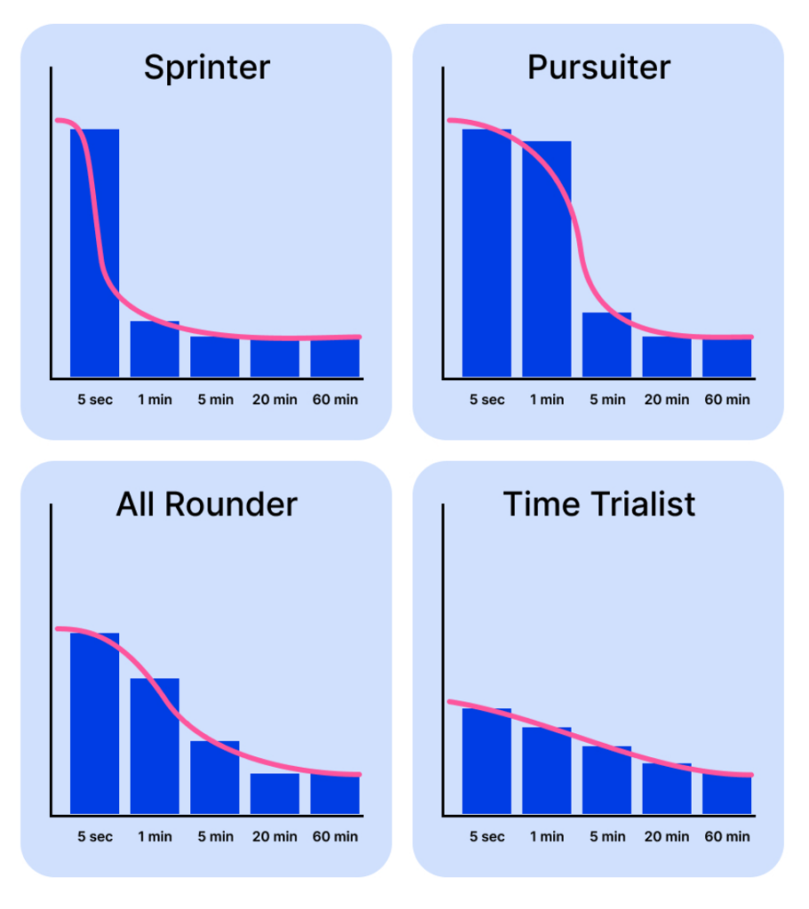
If an athlete has not recently completed maximal efforts across these time domains, the curve may be incomplete. This could reflect normal training cycles such as the off-season or a lack of emphasis on certain performance areas. In such cases, the 90-day curve becomes a roadmap for identifying gaps and planning testing or workouts to fill them in.
The mean max power curve turns a large amount of scattered data into a clear, actionable performance profile. It allows you to quickly assess the demands of specific workouts, evaluate an athlete’s current strengths and limiters, and prioritize areas for development. Whether you’re coaching a sprinter who needs to sharpen anaerobic power or a time trialist working on sustained output, the MMP curve provides a precise framework for tailoring training prescriptions.
Each time your athlete uploads a ride, review their curve with these insights in mind. You’ll gain a clearer understanding of their current form and what should come next in their progression.

")

")


