One of the new features in WKO+ 3.0 is the Scatter Graph, which takes the data from your power meter and plots it in a ‘shotgun blast’ type pattern. This is similar to the Quadrant Analysis in that both are scatter plots, but in Quadrant Analysis the data is not plotted on just the raw numbers. It’s plotted on the equations to create ‘average effective pedal force’ and ‘circumferential pedal velocity,’ whereas the scatter plot data is plotted just on the ‘raw’ numbers.
One of the great things about scatter graphs is that you can change the data that you want to graph. Want to graph Heart Rate on the Y-Axis and Power on the X-Axis to better understand how power fluctuates with heart rates? How about Speed on the Y-axis and Cadence on the X-Axis to see how much time you spend in one gear or another gear? Or what if you want to see cadence on the Y-axis and Heart Rate on the X-axis to give you a better understanding of how your heart rate changes for a given cadence? These are just some of the things that you can do with a scatter graph. Let’s take a little deeper look into three different scatter graphs that you might want to create in order to learn more about your training and/or racing.
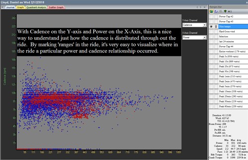
In Figure 1 below, we have a scatter graph of Daniel Lloyd’s Stage 3 Tour of Oman. The red colored section is a solid 40 minutes of riding when there was a chase going on for the breakaway. While he was sitting in, this gives us an idea of how narrow he focuses his cadence even in moderate tempo efforts. Note the fluctuation in power even though the cadence stayed in a relatively narrow range. When Daniel has to focus on producing power either at threshold power or even in the tempo level, he selects a specific cadence in order to do this. With years of racing under his belt, Daniel has optimized his cadence to best suit his ratio of fast twitch/slow twitch muscle fibers and also for the best economy.
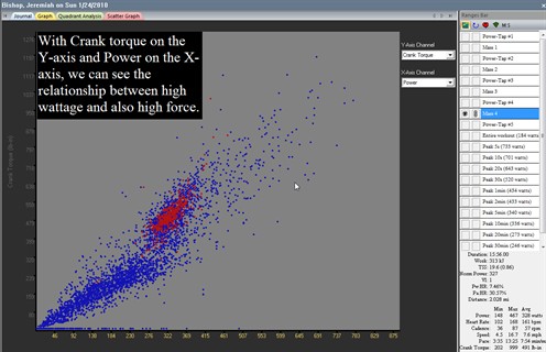
In Figure 2 below, we have a scatter graph of Jeremiah Bishop’s mountain bike ride with multiple repeats of a local climb. In this climb, he aimed to simulate an upcoming race in which he will have to produce a lot of force on the pedals, but at a lower cadence in order to maintain traction up the climb and also stay in front of his competition. The scatter graph that is interesting in this case (besides the Quadrant Analysis one of course!) is the Crank torque on the Y-Axis and power on the X-Axis. This is a nice confirmation that Jeremiah was producing enough force at an even output throughout the climb and at the wattage range that he needed to produce. This confirmation of correct execution of the workout is a nice thing to know and also visualize this relationship.
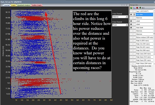
I quite like this final scatter graph even though it is only flipping the Axes from your normal view. In Figure 3, we have distance on the Y-Axis and Power on the X-Axis. The reason that I like this one so much is that it is much easier to understand the power demands by length of the ride. We know that in races, it’s typically the last hour that produces the most power, but how much power is needed really in the end, and when is it needed exactly? In Figure 3, we see a long team training ride by D.J. Dart, done on the second day of his training camp. I have created a ‘range’ around each of the climbs that he did in the ride. When viewing the data in this manner, we immediately see the natural stochasticity of the ride but in a vertical view. The red sections are the climbs themselves and notice how the power that he could do diminished fairly significantly throughout the ride, which is the result of fatigue. One thing that also is very interesting about this ride was that he had to produce a significant amount of power on the last climb and that came at over 5hours and 45minutes into the ride. The demands of the ride are very clear here and comparing this scatter graph to another one from an upcoming race (use Multi-File/Range Analysis to do this) could be very enlightening.
In conclusion, the scatter graph feature can be a nice tool to help you to continue to learn more about yourself, the clients you coach and the courses that you will ride on. There are many ways to view your data in WKO+ 3.0 and scatter graphs will help you to better understand your data in order to help you ride faster!