WKO4 introduces many new metrics that are specific to how you produce your power through your pedal stroke. With the introduction of left/right power balance in several power meters, WKO4 is able to use that data to give you more insight into how you produce your power. These charts can be found in the “WKO4 Pedaling Reports Pack”
Gross Power Review Chart
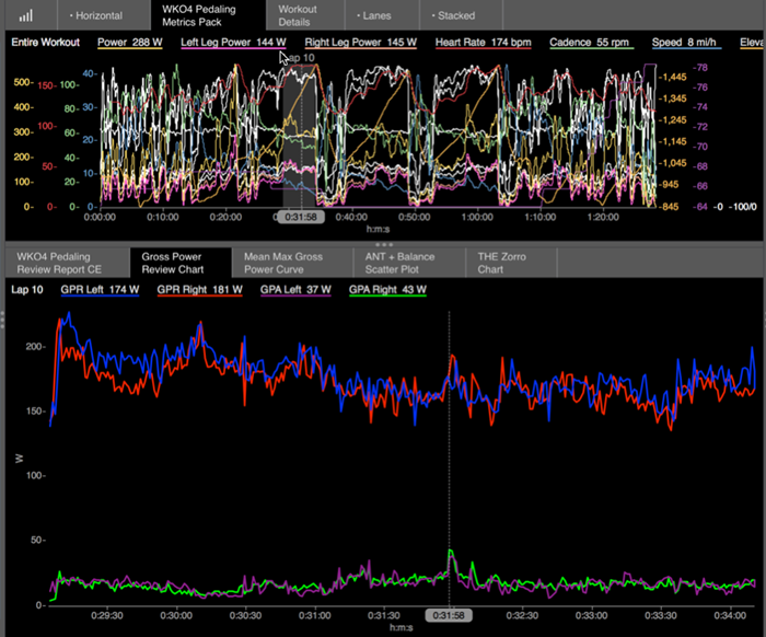
The first chart that you will look at is the Gross Power Review Chart, as seen in the screenshot below. The red line is your Gross Power Released for the right leg during whatever time period you are reviewing in the right hand explorer. The blue line represents the Left Gross Power Released. Gross Power Released (GPR) is the power that you are releasing on each pedal stroke to propel the bicycle forward. The green line represents Gross Power Absorbed (GPA) on the left leg and purple line is Gross Power Absorbed on the right leg. This is the power that is being produced but is not going to moving the bicycle forward and is being absorbed. This is generally resistance or negative power. Minimizing GPA will help you produce more overall power.

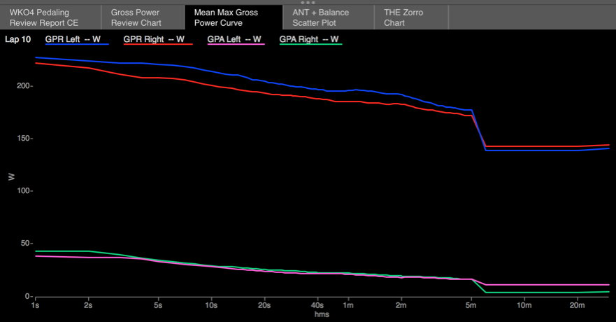
The next chart you will see is the Mean Max Gross Power Curve chart. This chart is the same data as in the Gross Power Review Chart, but now plotted on a logarithmic curve. This will make it even more apparent which leg is releasing and absorbing power. This chart is highly useful when reviewing intervals or very hard efforts. Again, reducing the GPA while maximizing the GPR will increase your total power. Notice, that in the below chart the left leg is releasing more power and both legs are absorbing the same amount.

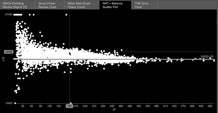
Next is the ANT+ Balance scatter plot. This can be a revealing chart because it can tell you where your balance changes throughout your ride. You might find that you are more asymmetrical on one side or the other. In the below figure, you’ll notice that this athlete is pedaling more with the left leg, especially below 250 watts. Above 250 watts, you’ll notice that both legs become more symmetrical. This could indicate that the right leg is being “held in reserve” until a hard effort is needed.

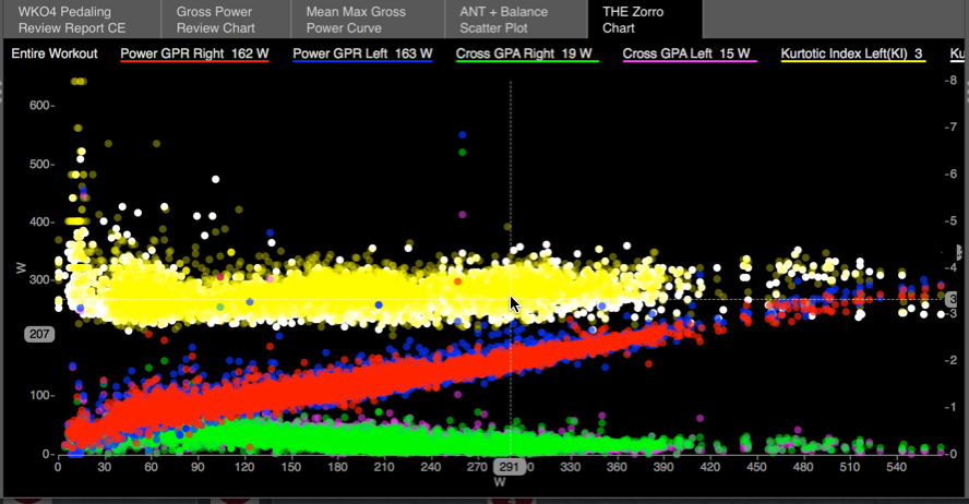
Finally, there is the Zorro chart. This is a scatter plot of both GPR/GPA and Kurtotic Index. This chart is very helpful to better understand the relationship between your GPR/GPA and how smoothly you pedal. The Kurtotic Index displays how “punchy or smooth” your pedaling stroke each and the higher the number the more “punchy” your stroke. In the example below, we see that this cyclists’ stroke is relatively smooth on both legs as his score is generally below 4. The left leg (yellow) is a little higher than the right leg (green)indicating a slightly punchier stroke and when compared to the GPA of the right leg. This shows that the right leg is absorbing more power. This is interesting in that the left leg punchiness could be causing the right leg to absorb power and make the overall stroke more smooth, but at a cost.

Be sure to like the WKO4 Facebook page to get the latest updates and information about using WKO4.

